Today, I was working on a project at work and I accidentally put a staked bar on top of a Treemap and had a thought about Marginal Histograms and if it made sense to do a similar “Viz-Stitch” and do a Marginal Treemap.
Honestly the jury is still out, but in certain situations I think it may make sense to have a summary visualization on a Treemap to help show high level distribution.
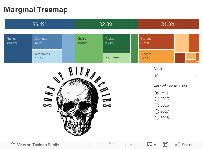
These are pretty easy to do, but you have to make sure that the treemap is narrow so it forces it to a “stacked bar”. Then you can align your higher level stacked bar on top.
Step 1 – the Treemap
For the example I’m using Superstore, so I am starting with category and sub-category as my dimensions (both as color in this example), then I use the Percentage of Total tables calculation on Sales as my measure for the label, and Sales again as the size. Sort by Sales descending.

Step 2 – the Stacked Bar
Quickest way is to duplicate you Treemap sheet, then remove the Sub-category and switch the a Bar on the marks card. Your category colors should be the same shade as you Treemap colors. If it isn’t, you’ll want to adjust accordingly. Sort by Sales descending.

Step 3 – stitching it together
On a Dashboard, add the Treemap and the Stacked Bar, making sure the Treemap is narrow and forces its perspective to a segmented stacked bar chart. Hide the title of the Treemap and set the axis of the stacked bar to a fixed size of 0 and 1 then hide the axis of the Stacked bar.

That’s it!
In my example I also added a Year filter and a Map to make sure the perspective held as the values changed, and so far, so good! Also, a Highlight action makes for a nice focus element. Check out the interactive version below.